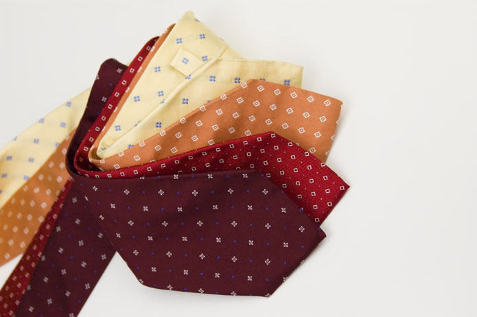
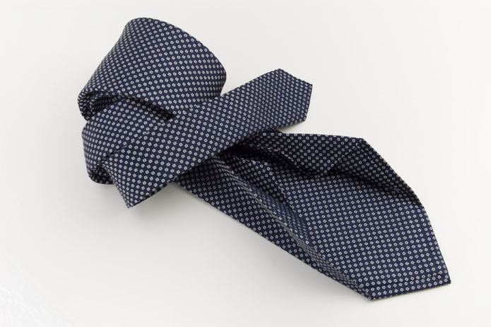
The colour of good taste: colour analysis
Colour is one of the most important elements of personal style. In the daily choice of jacket, shirt and tie, what truly makes the difference is not the single colour itself, but the way colours are combined with one another.
Colour analysis makes exactly this possible: creating balanced, harmonious and tasteful combinations. In the language of colour, every shade conveys a precise message, yet in everyday life colour almost never stands alone and always interacts with other tones.
In daily life, and especially in professional settings, clothing revolves around three fundamental elements, each defined by colour: shirt, jacket and tie. In most cases the tie is not even plain, but features patterns and motifs.
How can you create colour pairings that are correct, balanced and pleasing? Many people have natural aesthetic sense, others possess strong chromatic sensitivity, but often that alone is not enough.
The technique of colour analysis
Colour analysis means creating harmony between colours, preventing one from overpowering the others and encouraging visual balance instead. This technique, as effective as it is often overlooked, makes it possible to create correct pairings in every situation.
Every day we ask ourselves: which jacket, which shirt, which tie? The goal is always the same: to achieve a tasteful combination. Every tie can be paired with different shirt and jacket colours, creating a different image each time.
In general, when two or more colours are combined, two opposite outcomes are possible:
- an armochromic image, in which colours enhance one another: harmonious, clean and elegant
- a disharmonic image, in which one colour dominates the others: disordered and visually unpleasant
How to create a harmonious colour pairing
Colour is a physical phenomenon and, as such, follows precise rules. Colourimetry is the principle that guides harmonious combinations.
Colours are broadly divided into two large groups:
- Warm colours: they contain a yellow component, such as yellows, browns, camel, cream and ivory
- Cool colours: they contain a blue component, such as navy, grey, light blue and optical white
When cool colours are paired together, such as blue and grey, the result is harmonious. When warm colours like camel and cream are combined with a cool colour such as a blue tie, contrast appears and the image becomes visually discordant.
The two images compared
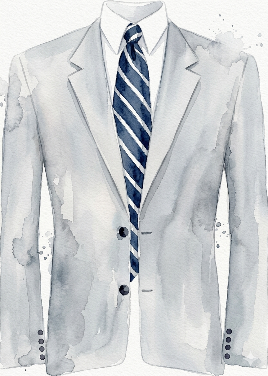
Armocromia OK
Image A. Cool colours paired together, such as blue and grey: the result is harmonious, clear and elegant.
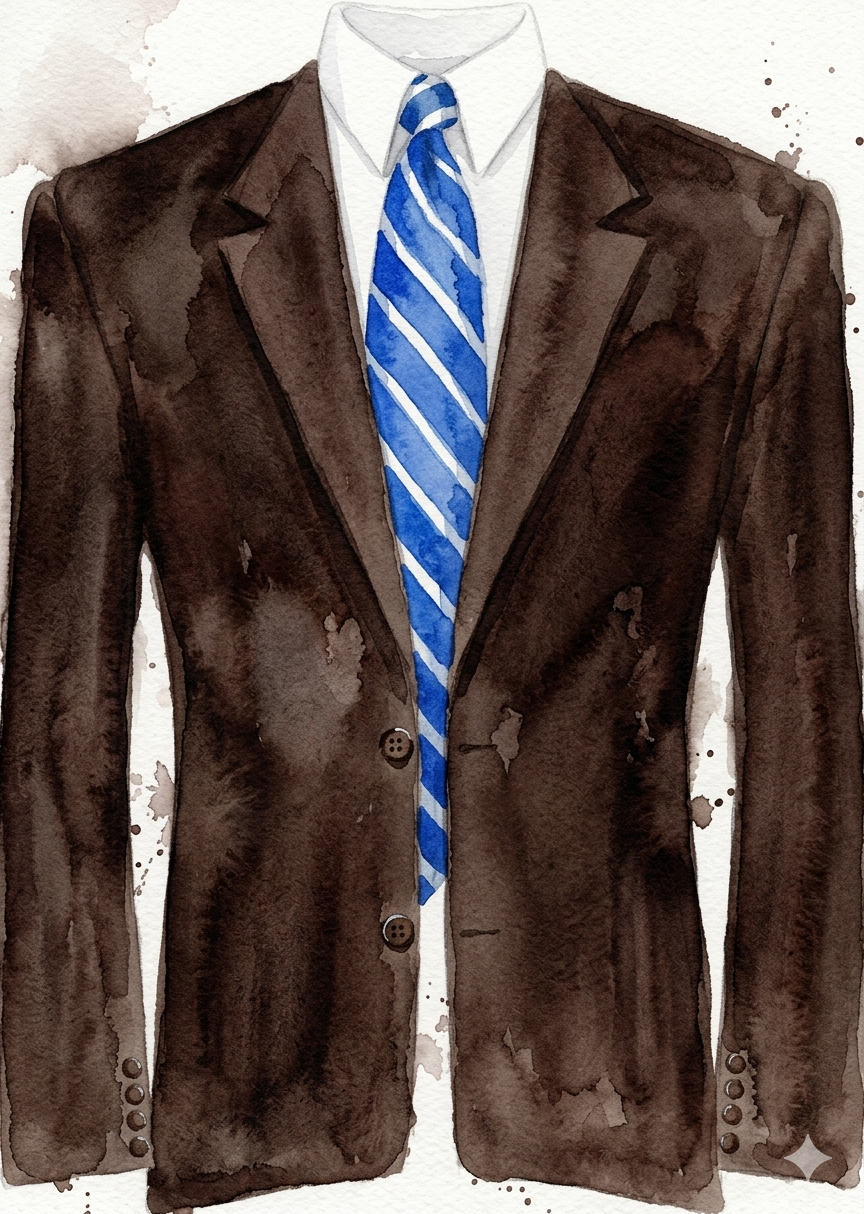
Armocromia NO
Image B. Warm colours such as camel and cream combined with a blue tie: the contrast creates visual discord and breaks the balance.
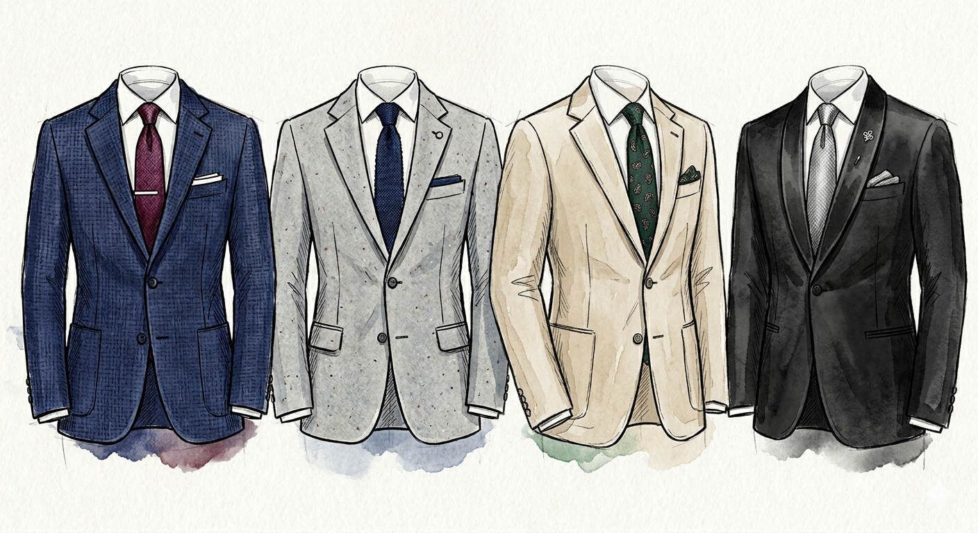
Basic rules
Basic rule 1
- good taste means harmony
- an effective pairing is always harmonious
- a winning combination is an armochromic combination
Basic rule 2
- always pair warm colours with warm colours
- always pair cool colours with cool colours
By following these two simple rules, mistakes become almost impossible.
Pairing with the shirt: simple advice
The basic rules are:
- plain tie ? striped or patterned shirt
- decorated tie ? plain shirt
- a light tie works better with a darker shirt
- a dark tie works better with a lighter shirt
Even at this stage, good taste remains essential.
Long live His Majesty the tie: use and care
If you own a good number of quality ties, they can last a long time if treated with care. Here are a few simple rules:
- Do not wear the same tie on two consecutive days
- Do not merely loosen the knot: remove the tie when necessary
- Do not pull it over your head with the knot still made
- Hang it or store it carefully after use
- Use steam to relax creases
- Iron only when necessary, with a protective cloth
- Blot stains without rubbing
- When travelling, use a tie case or protective cover
- Do not throw away old ties: fashion always returns
Useful advice for choosing and wearing a tie
The knot
The knot must be proportionate to the shirt collar. A simple knot suits smaller collars, while a larger knot requires a more open collar.
Pairing with the shirt
The same rules remain valid: plain tie with patterned shirt, decorated tie with plain shirt, light on dark and dark on light. In this case too, good taste is decisive.
Style as personal expression
Colour analysis is not a rigid rule, but a tool: it is meant to guide, not to limit.